Saturday, April 21, 2007

Unnatural Acts: Three, or Five?

I live in Southern California, just a short drive (meaning forty minutes at night, and up to four hours at other times) from the Belly of the Beast, Hollywood. Of course, very little of what people mean by ‘Hollywood’ takes place in Hollywood any more, so the town today is really more like the Bladder of the Beast, but that’s really beside the point. If you’d stop interrupting, maybe I could get on with this.

Since every fourth person you meet here is an aspiring screenwriter (two of the others are aspiring actors), the idea of the three-act structure pervades daily life. Sit in any Starbuck’s and you’ll see a dozen people who can’t visit the toilet without parsing it: The locking of the door propels us from Act I into Act II. First Complication—the seat is dirty. First response…

Well, I suppose it’s better than the other screenwriting paradigm, Joseph Campbell’s Hero’s Journey. I don’t even want to contemplate how the Call to Adventure and the Refusal of the Call fit into visiting the toilet.

I’d always assumed the film community, and in particular that master of saying little at great length, Syd Field, were to blame for the three-act paradigm. (By the way, if you’ve ever wondered who is to blame for the whole paradigm of “paradigm,” that was Thomas Kuhn in the Structure of Scientific Revolutions. But he’s ten years departed, so don’t bother to write him to complain.)

Okay, it’s hard to get around the idea that stories tend to have a Beginning, Middle, and End (sometimes even in that order). I was always a little more skeptical about the idea that these proportions could be divided 33:33:33 (with one percent left for the Church) or, only slightly more imaginatively, 25:50:25 (the agnostic approach).

I assumed this was merely residue from traditional theatre, and went happily on my way, ignoring Acts. Basically, if anyone’s theory about the true nature of The Novel can’t contain Tristram Shandy, I say to hell with it, and that includes Three Acts.

I’ve been reeducated. The Three-Act Structure isn’t really a theatre concept. For starters, the admirable novelist and critic David Lodge pointed out:

Throughout the nineteenth century, for example, novels were commonly published in three volumes, mostly to suit the convenience of the circulating libraries, who able to lend out one novel to three readers at once, but the practice may also have encouraged authors to see their novels in terms of a kind of three-act structure (it is possible to break down the action of Jane Austen’s Emma in this way, for instance).


Huh. You mean we started it?

I was further thrown off balance when I met Mark Sarvas, screenwriter and novelist (and proprietor of The Elegant Variation). I was whining to him about the long desert of the middle of a novel—I still admit that novels have Beginnings, Ends, and Middles, oh lordy sweet Jesus, do they ever have Middles—and he suggested to me that the middle of a novel really consists of three acts in itself. This took us back to the standard dramatic structure of beginning, three middle acts, and ending, making five standard acts in all…

Five? Oh, yeah, like Othello, and Macbeth…How could I have forgotten that all classic theatre tended to revolve around five acts?

I’m still suspicious of the neat theorizing of novels into segments, but I embraced Mark’s idea of chopping the middle into segments instead of steadily rising action, and ever since it has felt a lot less as though I’m crossing the Great Plains in a Conestoga Wagon.

Five acts. That Shakespeare guy may have been onto something.

Sunday, April 15, 2007

Travel Looms

I'm going to be in Germany and Switzerland for the next couple of weeks, and hopping from place to place, so my contact with everyone may be sporadic. (And I wanted to write than sentence because I love the word sporadic and don't get to use it often enough.)

I'll continue to drop the occasional post, but my replies to comments or e-mails may be delayed, since I may not see incoming traffic regularly. But drop through and say hi anyway.

Even if you do it sporadically.

Saturday, April 14, 2007

The World's Most Boring Post? You Decide

I'll warn you upfront: It's about manuscript formatting.

I have opinions on the topic that deviate from conventional wisdom, but, even then, it's hard for me to maintain that this will be a dramatic, suspense-filled post. (Look, guys--renegade formatting! Shall we read about that...or watch the Teletubbies?)

There's three items I want to touch on, each more thrilling than the one before: Fonts, Margins, and Headers/Pagination. Buckle up, we're in for a wild ride.

DISCLAIMER: If an agency or house declares what they would prefer in terms of manuscript formatting, for the love of Pete (whatever that means) give it to them.

Fonts

There seem to be three schools of thought on the topic of fonts:

Courier Only, Infidel: Many of the Courier lovers are old-school types (or folks who have been associated with screenwriting). Some of them are handy at doing eyeball word counts based on secret whitespace formulas they learned from Max Perkins, though some of the formulas require dragging out the old slide rule. They may tolerate a manuscript in something other than Courier, but they won't be happy about it. Copyeditors tend to prefer it, but when you are submitting for acquistion or representation, the copyeditor is miles down the road (and can usualy print it out to please themself, since by that late date you and your publisher are usually dealing in electronic copy).

Ya Gotta Change with the Times (New Roman): TNR freaks tend to be on the young side (and many agents and editors are). Many of these folks have never seen (much less touched) a typewriter, but they can do 50 wpm on their Blackberries. If you send them a manuscript in Courier, they'll worry you're a fusty old Luddite who won't be able to open e-mail attachments.

The Get-A-Grip School: The redoubtable Miss Snark is the foremost advocate of a philosophy that says a writer has more important things to worry about and that any agent or editor you really want to be associated with won't really give a damn what font you use as long as it isn't utterly frou-frou. (I think she's absolutely right, but I'm going to ignore that fact. Otherwise I won't be able to complete this post.)

Why Courier is great: Courier carries along lots of extra whitespace. That means less words per page. That means that, ceteris paribus, the pages turn faster.

Why Courier is not so great: Aside from the fact that it looks like you borrowed Grandma's typewriter to hammer out your 7th-grade book report, Courier isn't that easy to read. Many people find themselves sort of s-p-e-l-l-i-n-g o-u-t e-v-e-r-y w-o-r-d when they read Courier. Some publishing professionals claim Courier is intrinsically easier on the eyes and quicker to read...but I notice they seldom publish their books in Courier. Don't they care about our eyes?

Why Times New Roman is great: TNR is a clean, no-nonsense, proportionally spaced font. It looks professional, and most studies show it's easier to read, as the words are tied together into packages.

Why Times New Roman is not so great: It's dense. Oh, baby, can it pack the words into a small space. Readable, yes...but you may feel as though the page you are reading was written in the 19th Century by someone who was being paid by the word. Probably translated from the Russian (poorly). Any minute now, you expect itty-bitty footnotes. All things held equal, Times New Roman may be easier to read...but those are lonnnnngggg, dense pages. (If you are worried about minimizing page count rather than word count for some reason, Times New Roman is the way to go.)

Courier moves the pages faster, Times New Roman speeds the eye through each word. It's a tradeoff, but I've got a sneaky solution. Which brings us to...

Margins

The so-called 'standard' margins are one-inch all around. I agree that whatever you do, you should never go narrower than this. In fact, one-inch margins with Times New Roman to my eye look impossibly cramped already, so narrowing the margins would make your text look like the fine print on an insurance form.

Wider, on the other hand...

I use 1.5 inch margins on Left, Top, and Bottom (LTB), and 1 inch on the Right (where the ragged margin contributes its own white space.) It might seem that this would make the text look tall and skinny, but in fact it looks fine, and I've never had anyone remark on how it appears. (Trust me, the crowd I hang with will remark on anything.)

Here's the secret to this manuever: to a very close approximation, in the number of words per page, 1.5" LTB and 1" R in Times New Roman equals 1" LTBR in Courier.

In other words, using Times New Roman and widening the margins to 1.5 inches LTB gives you the same word count per page as Courier with standard 1 inch margins, but the proportional spacing of the Times New Roman draws the eye along more rapidly. I believe the net result is the reader turning pages faster, and feeling less cramped, than under either of the standard approaches.

I started using this format intuitively, feeling that Courier was clunky and outdated and Times New Roman was too dense. How do I know it works? I don't. I only know I've never had any complaints; but I have had many compliments about my page-turning writing. Now, I like to flatter myself that at least some of that is a result of my prose, but I'm pretty sure that going for this best-of-both-worlds' formatting approach has never hurt me.

Headers/Pagination

I can't claim authorship of this last idea, since I outright stole it from Sol Stein, a great writer and a great editor. (He's one of those who asserts, by the way, that an advantage of Courier is that the lower word count per page makes the pages turn faster.)

Stein claims that when the reader hops from the bottom of one manuscript page to the top of the next, anything in the header temporarily distracts the eye. So he makes what he calls a "sly" suggestion: use footers rather than headers. Keep the page numbers and author name down at the bottom. The momentum of the sentence will draw the reader right past the footer and up to the top of the next page without pause.

I think he's right. I don't always do it that way, and it looks a touch odd at first, but when I've done it, it doesn't seem to have perturbed anyone. It seems to have helped preserve continuity, which is a bigger problem when one is flipping loose manuscript pages than when one is reading a printed book.

Okay, Already

I admit that was probably boring. And Lord knows that skillfully deployed formatting in your manuscript will win you no kudos from the critics (who will never see it in any case). None of this matters nearly as much as the writing itself. Agents and editors are schooled in reading past the mechanics of presentation...when they are in the mood. Problem is, it's easy to hit them on a bad day. I think they need all the help they can get. So do our manuscripts.

As more manuscripts are submitted electronically, of course, this will matter less, as the recipients will change the fonts and margins to whatever they damn well please.

Wednesday, April 11, 2007

Mission Accomplished?

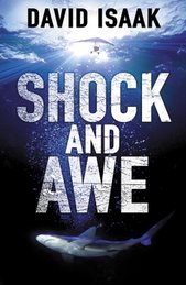
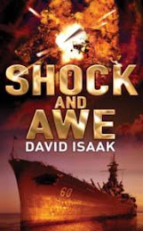
Houston, we have a title. What was once Smite the Waters is now Shock and Awe.

There were some close contenders. David Thayer casually tossed out Carla's War, and that came near to ending up on the cover.

Equally casually, Pamela Blake handed over Patriot Acts, and that one would probably be the title now were it not for the fact that Greg Rucka has a book of that title coming out in August. Grrr. (She also proposed Unveiled Threat, which was quite clever in terms of the storyline, but oblique.)

Shock and Awe was contributed by MNW editor Will Atkins (along with a few other possibilities), and survived through the massive winnowing process.

And where was I in all of this? Pretty much on the sidelines, as it turns out. I came up with a few possible titles, none of which I loved (my heart still belonged to Smite). Some seemed passable to me, but as it turns out I tend to prefer titles that are allusive and noncontemporary. In other words, titles that have gravity but lack specificity.

In the end, it came down to Shock and Awe versus Carla's War. Both were apparently popular enough around Macmillan. I leaned slightly toward Carla's War because of the touch of incongruity, but came round to Will's belief that Shock and Awe not only underlines the connection with the War on Terror, but also has, at this point, a nice ironic feel to it.

In fact, words connected with the War on Anything tend to acquire an ironic feel rather quickly, cf. "War on Poverty" and "War on Drugs." (Sure am glad we don't have poor people or drugs anymore. )

If you're bored, you might want to check out the "Lulu Title Scorer" Charles Lambert steered me to:

http://www.lulu.com/titlescorer/index.php

I have serious doubts about the validity of the results, but it's a nice way to waste some time.

In any case, the baby now has a name, and I can go out in public again. I hope to be able to put up the jacket on this site some day soon.

Monday, April 9, 2007

In Which I Reclaim My Name

Visitors to this blog may have noticed a pair of links--now vanished--labeled No, I'm Not THIS David Isaak (whether with a 'c' or a 'k').

When I first entered the blogosphere, I was taken aback to realize that that Google searches on my name were delivering up as the top hit DavidIsaak.com, the website of David Isaak, a young comedian in LA.

His website pointed to his MySpace site, where he is listed as David Isaac, with a 'c'. Apparently he thought spelling it with a 'k' for his stand-up work might have some resonance, making people think of singer/songwriter/actor Chris Isaak, or tennis player Ron Isaak. Since I also live in Southern California, I somewhat concerned that people would think I and he were the same person. No tragedy, you might think, but his posts show he writes in a somewhat different voice than I do:

David Isaac's Bio: I roll by the name of David Isaak. I am a white cat from a small town called Los Angeles, you may have heard of it... Number One, All Glory to God because if He hadn't saved me I would be either in Jail or Dead, that's real.

Seeing as I also am a white cat (though I've heard that all cats are black in the dark), and since I also roll by David Isaak to the extent that I roll at all, you can see why this might be a worry.

Recently, DavidIsaak.com dropped from sight, and reemerged as DavidIsaacLeach.com. So I'm guessing his name wasn't David Isaac or David Isaak, and that both of those were names by which he rolled. (Either that, or he's gotten married and taken his wife's name.)

Nothing wrong with "Leach". Cary Grant's birth name was Archie Leach. Archie Leach is also the name of the character John Cleese plays in A Fish Called Wanda, and he's quite debonair. And ends up with Jamie Lee Curtis.

I could have told him 'Isaak' wouldn't be worth the trouble. People can't work out whether it's Gentile or Jewish (I'm the former, but the surname can be either). People from Pennsylvania and neighboring states tend to think of it as a Mennonite or Amish name and spelling, and expect me to have a beard but no mustache.

In any case, being only five letters long, it must be the most misspelled name in the world per letter. (When dealing with the airlines, I've learned to say, "India, Sugar, Alpha, Alpha, Kilo," but this doesn't work well in everyday life.) There's a lot of ways to go wrong. Isaac, of course, and Isaacs and Isaaks. And, some play it safe, resulting in Isaack or Isaacks. Others remember only that it's spelled weirdly, with a double letter, so you get Issak. Or Issac or Issaks or Issacs, all of which make some sense--after all, what kind of a messed-up name has two a's in a row? But then people stare at it and decide neither Issak or Issac look right, so you get Isak or Isaks or Isac or Isacs or Issaak or Issaaks or Issaac or Issaacs or Issaack or Issaacks. The only thing you can really count on is that it will start with an I. Usually.

Mr. Leach is saving himself a great deal of trouble. I wish him well, wheresoever he rolls.

Meanwhile, the domain name DavidIsaak.com was immediately snatched up by a domain-squatting company who have put it up for auction. I really can't imagine bidding will be fierce, but I was shocked that anyone would acquire that domain name in the first place. Weird, huh?

Saturday, April 7, 2007

Wait, and See What’s Left Standing

[M]any of us…served an underpaid but invaluable apprenticeship in pseudonymous paperbacks—the kind of apprenticeship the lack of which is sorely evident in the work of many younger writers, mostly through no fault of their own; that paperback market no longer exists. It makes me worry about the next generation of popular writers: where will they get their on-the-job training?

—Brian Garfield, 1981

It’s even truer now than when Garfield wrote that a quarter-century ago. There was a time when writers of popular fiction did much of their learning in public. Dean Koontz published fifty-four novels (under several pseudonyms) before Strangers became a hardcover bestseller.

Lawrence Block had probably published as many books as Koontz, or even more, when he finally had a critical and commercial breakout with Eight Million Ways to Die. (8MWD is still rightly regarded as one of the best noir novels ever written, but it was the fourth in the series about Matt Scudder—and Block wrote it in spite of the fact that his publisher had dropped the series, deeming the books noncommercial. Brave guy.)

Almost as many writers, especially literary writers, served out their apprenticeships in magazine fiction, working their way from the dozens of low-paying magazines up to the high-rent district of Playboy, Atlantic, Esquire, and, of course, the New Yorker.

By the 1970s, the mass-market paperback original was on its way out. Mass-market paperbacks weren’t vanishing, but they were increasingly made up of “airport books,” mass-market editions of hardcover bestsellers. Today, mass-market paperback originals are generally restricted to very niche markets—certain classes of romance, some kinds of hard science fiction, and cozy special-interest mysteries featuring murders among, say, llama-breeders, knitting circles, or teachers at religious preschools.

Agent and long-time industry observer Richard Curtis has written a brief history of the rise and fall of the mass-market paperback, ending with the final collapse of the distribution system in the summer of 1996; like anything Curtis writes, it’s well worth reading. (One thing Curtis doesn’t mention as a factor in the equation, however, is the decline of written pornography in the face of increasing availability of sex films and, ultimately video. Some important bestselling writers got their start in the sex-novel industry of the 1960s, but home video players killed this genre dead as the Dimetrodon, and it’s only been recently that ‘Erotica’ has begun to re-invade the bookstores.)

At the same time mass-market paperbacks were declining, the magazine markets were heading south. Not that magazines were disappearing; new magazine titles continued to pop up like pimples before a first date. But fewer carried fiction, and even some of the traditional mainstays began to cut back. Specialized mystery, sci-fi, and romance fiction magazines have almost vanished, with only a few stubborn titles clinging to life. There are still literary journals, such as the veteran Paris Review, the successful Glimmer Train, or upstarts like McSweeney’s and Swink, but it may be easier to get your novel published by a good house than to fight your way through the thousands of submissions the good lit mags receive every month to publish even a single short story. The online magazines offer wider possibilities--but, unfortunately, in most cases readership is low and many in publishing discount them as credits.

It’s fashionable to complain both about the low quality of fiction these days, and about the fact that few people read, but the truth is that back in the days when readership was widespread the literary bar was set far lower. I’m not talking about the top of the food chain, here—the best fiction has to offer has always been great, and identifying a golden age of literary achievement is a matter of taste. But in the 1930s through much of the 1970s, the average was pretty lousy. Most published fiction was written for the market later filled by TV; parking attendants read books in their booths, and muggers read pulp novels while waiting to rob commuters. If you don’t believe me, go to a used bookstore and find yourself a half-dozen random paperbacks in a half-dozen genres from the 50s and 60s. Sorry, nostalgia buffs: the bad books of 1966 make the bad books of 2007 look like great literature.

We once owned a 1907-vintage house in Seattle—what passes for ancient in that part of the world. It sat on a steep slope, and, in the basement cut into that hillside, you could walk beneath and beside the mighty posts and beams that supported the building.

When we were having some work done, I was down in the basement with a contractor, and he remarked on the sheer size of the crossbeams, each the width of a man’s shoulders, sawn in a single piece from the heart of an old-growth Douglas Fir. I made the usual don’t-build-‘em-like-they-used-to remarks, but he cut me short.

“Most of everything built,” he said, “has always been crap. It’s just that the crap falls down. What people see is the stuff that’s still standing.”

Hmm. Guess that brings us back to Brian Garfield’s original question--where do writers practice today? And, while we're practicing, what are we supposed to do with all our crap?

Tuesday, April 3, 2007

Slash-and-Burn Novel-Writing

We were once so close to Heaven
Saint Peter came out
and gave us medals, declaring us:
“The Nicest…of the Damned.”

They Might Be Giants
“Road Movie to Berlin”

Hollywood legend has it that Paul Newman was infuriated by the number of times he was nominated for Academy Awards before winning for Color of Money. While I feel sorry for Paul (who, god knows, deserved it at a minimum for The Hustler and Cool Hand Luke in the early days, and for other reasons since), there are two lower categories of high achievement one can fall into.

Sure, it would be possible to figure out who had the most nominations without winning, but I want to talk about the category of high-level achievement one step down from that. Somewhere out there is an actor who has almost been nominated more times that anyone else. But it’s impossible to know who that person is, since they never even made the shortlist. It’s an invisible achievement.

That’s what admiring rejection letters are like. They’re admittedly better and more encouraging than letters suggesting that you couldn’t write your name in the dirt with a rock, or recommending that you clutch your manuscript to your chest and take a long walk off a short pier, but they aren’t generally good for much. You can’t show them to editors as leverage—here, look at all the great rejections I have!—and you can’t sell an agent’s letter for the autograph. (Okay, you might be able to get a hundred bucks or so for an original Amanda "Binky" Urban, but I’m betting she doesn’t sign anything except contracts and royalty checks.) A pile of great rejection letters reads like the CV of Sir Robin from Monty Python and the Holy Grail: “Sir Robin the Not-quite-so-brave-as-Sir-Launcelot, who had nearly fought the Dragon of Agnor, who had nearly stood up to the vicious Chicken of Bristol, who…”

And what’s my point? I don’t know, but I had fun getting here. Oh, sorry (clears throat). I won’t claim to have a monopoly on admiring (nb: “useless”) rejection letters, but I have some real doozies, and a number of my finest rejections were for my novel A Map of the Edge, which I finished at the end of 2003.

A number of agents loved the opening chapters of MOTE; one lit-fic agent even said “It’s one of the most amazing openings I’ve read…”. But. Ah, yes, but. In the case of this letter, after some other wonderful make-nice sentences, we go on to the middle of the novel, where it becomes, um…well, I see the word “rudderless” here, and “desultory” (both of which are such nicely chosen words that I think he should be writing and I should be agenting his stuff). “Navel-gazing” also pops up, along with the note that he never made it to the end, but would love to see it again if I ever rewrite it.

I had a few of those offers, though I suspect the agents in question aren’t still watching their mailboxes in anticipation four years later.

I’m trying to rework MOTE—well, actually, after leaving it three years in the drawer, I’m edging up to it warily, ready to jump back, like a carrion crow uncertain if the seeming corpse is truly dead.

Now, it’s not as though I haven’t thought about MOTE in all this time. I just couldn’t figure out how to tweak it, how to make a few changes to give it a “rudder”, how to make it more undesultory, more, um, sultoracious, if that’s the word (and it can’t possibly be).

Sad to say, the problem is that it can’t be ‘tweaked’. My evaluation, having stared at it for some time recently, is that the start is good, the climax itself is good, and everything in between has to go. Which is roughly 85% of the words upon the page.

I couldn’t have made this decision without letting it sit for so long. It was too fresh in my mind, the storyline seemed too inevitable as it stood, the scenes were too vivid, and I couldn’t imagine any other way the plot could have developed. But now I feel kinda good about it.

Excuse me while I go out to the garage for my chainsaw.

And the parts I cut won't go to waste. Expect my novel The Rudderless Desultory Navel-Gazer some time in the near future.

Monday, April 2, 2007

And, speaking of cover matters...

Has anyone noticed that, around the time of The Secret War, the Macmillan New Writing logo changed? (I'm not suggesting there is a connection with The Secret War, though there might be. Check the Vatican catacombs.)

The logo has always been a representation of an open book, viewed from an oblique angle. (This seems to be my week for the word 'oblique'.) But it started as black on white. It is now white-on-black, and has little outlines to make it more obvious that it is a book.

It's an improvement if you like literal. The previous incarnation had better Rohrshach ink-blot uses. I tended to see it as a large bat in flight--though I could also manage a male Boat-Tailed Grackle facing to the right, with its tail spread in threat posture.

I can't do anything with the new one. Even if I squint, it still says 'book' to me. Which I suppose is a good thing.